Website Design
Real-estate website journeys: what buyers and sellers need before they contact you
A closer look at Jared Looser's Utah website and the Alder & Summit demonstration, with a practical way to review your own buyer and seller paths.
← The Signal — BlogIn this piece
A buyer exploring an unfamiliar area and a homeowner considering a sale arrive with different questions. If both are sent directly to the same contact form, the website has skipped useful work: helping each person understand the offer, see relevant evidence, and choose a sensible next step.
For a real-estate business reviewing its website, the journey is a more useful unit of design than the homepage section. Follow one person from their first question to the point where contacting you feels appropriate.
Jared Looser: establish the place and the person
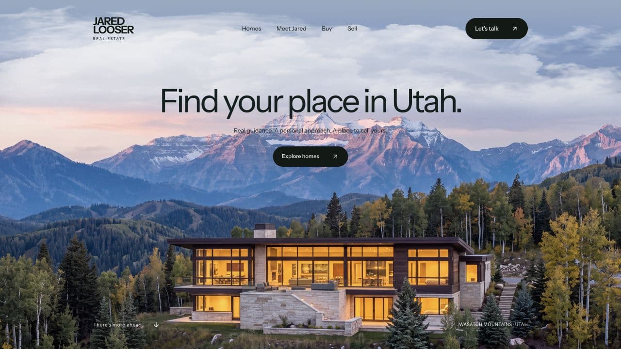
The published Jared Looser project includes listing discovery, buyer and seller journeys, local guidance, and direct contact paths. In the opening image, the setting and headline establish Utah immediately. That lets the rest of the page concentrate on helping a visitor move forward.
Three decisions are worth examining when you visit the live site:
- Place comes before detail. The landscape and headline provide a geographic context before a visitor studies an individual home.
- Property discovery has a purpose. Listings give buyers something useful to explore rather than requiring a conversation before they can assess fit.
- Personal credibility supports the next step. Jared's identity, local focus, and brokerage context help visitors understand who they would be contacting.
These are design observations and published-scope facts. We have not measured an uplift in enquiries for this article. The live site can also change after this screenshot was captured.
Alder & Summit: explore a different expression of the same journey
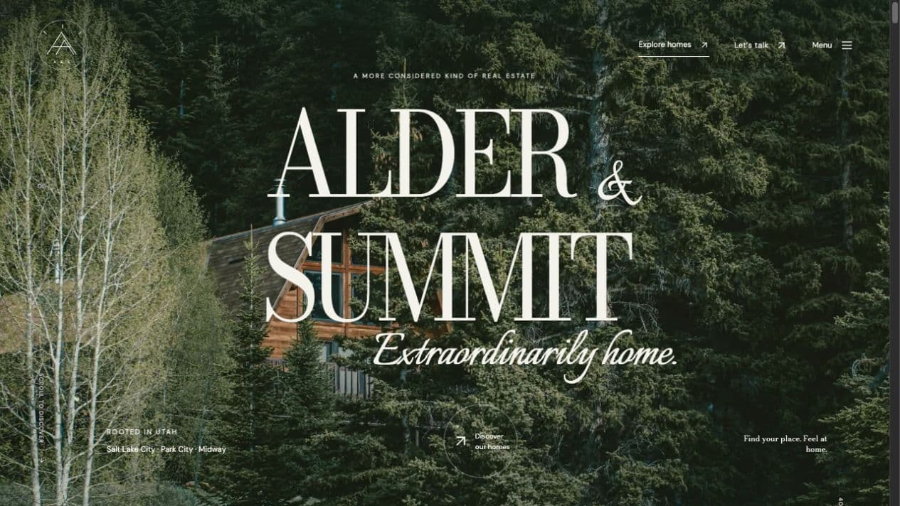
The Alder & Summit demonstration uses sample residences, community pages, buyer and seller paths, and a home-finder experience. The quieter wooded setting expresses a different visual identity, while the structure still has practical work to do.
Community information can help someone orient before comparing individual properties. A sample property page then narrows the question from “Where might I want to live?” to “Is this kind of home relevant to me?” A contact invitation belongs after enough context to make the conversation specific.
The lesson is not to copy the cabin or the typography. It is to make the visual identity support a recognizable path through the business.
Review buyers and sellers separately
Use this as an illustrative planning worksheet for your own site. It is not a description of every feature on either example.
| Visitor | Question before contact | Useful page content | Appropriate next step |
|---|---|---|---|
| Buyer exploring an area | Does this agent understand the places I am considering? | Accurate local context and a clear way to explore homes | Discuss the search or ask about a property |
| Buyer with a specific home | What can I learn, and how do I arrange the next step? | Current property information with its source and limitations | Ask about availability or a viewing |
| Seller weighing a move | How would this person help me prepare and sell? | Selling process, relevant experience, and expectations | Discuss the property and goals |
Keep claims current. If property information comes from another system, understand how it updates and where a visitor goes when they click. Do not imply that sample listings are live inventory.
Test the last few steps on a phone
Choose a listing or service page, read the relevant guidance, then attempt the enquiry. Check whether the form explains required information, whether the keyboard covers an important instruction, and whether a person can recover from a missing field.
Visible labels and clear instructions help people complete forms, including those using assistive technology. W3C's form guidance is a useful reference when reviewing those details.
Ask what happens after submission. A confirmation should accurately explain the next step without promising a response time the business has not agreed to meet.
If you are planning changes, the website redesign guide helps separate a focused repair from a full redesign. Website Design at Jiberish Labs covers the public experience, from page structure and messaging through the responsive build and launch.
Put this into practice
Bring the decision you’re working through.
A working session is a chance to review your goal, the tools or website you have, and the help you need. We’ll identify a sensible next step and discuss scope before any project commitment.
Website Design →Book a working session